Why some apps feel expensive
Wyatt Feaster's videos on premium apps and the psychology behind them, drawn, and shown in real screens from my apps: anticipate, stay calm, design the peak and the end, and know where hooks become traps.

Meer Habib
Senior Mobile Engineer · Chittagong
Some apps feel expensive the moment you touch them, and it's rarely the colour or the font. It's a few dozen small decisions, most of which you never notice, because they worked.
Wyatt Feaster has three short videos that name a lot of those decisions: why some apps feel expensive, the psychology that makes an app feel better, and the psychology that makes apps hard to put down. They're worth your twenty minutes. This is all three in one place: each idea drawn, the research behind it, a famous app that does it well, and real screens from apps I've shipped. At the end there's a skill file, so your coding agent can work this way too.
It's grouped by the question each idea answers, not by video. The last part is about hooks, and where they stop helping.
1. Meet people where they are
Wyatt's best analogy is a good hotel. Nobody asks if you'd like your bed turned down; it's done before you get back. The drink arrives before you think to ask for one. Premium service is mostly anticipation, and so is a premium app.
In practice that means the next step is already half done. The address from last time is filled in. The delivery window people usually pick is already selected. The recommendation is the first thing on the list, not the twentieth.
Checkout
Address
City
Phone
Delivery
Checkout
Deliver to
Home
Same as your last order
Phone from your account
Delivery
Tomorrow, 9 to 11your usualOther timesPay €24Anticipating also fixes choice overload. In the well known jam study (Iyengar and Lepper, 2000), a table with 24 jams drew a bigger crowd than a table with 6, but the people who stopped at it were about a tenth as likely to buy. A later meta-analysis found the effect depends on the situation: it bites hardest when options are hard to compare and people don't yet know what they want. That describes most people opening most apps.
So: recommend one, and keep the rest one tap away. Group, filter and search when a list is long. Remove what nobody picks. Gmail's Smart Reply is the famous version: three likely answers, one tap each. Here it is, and the same idea in three of my apps.
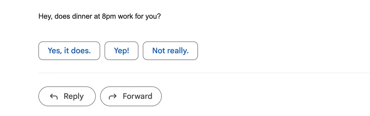
Gmail
Smart Reply guesses the three answers you are most likely to send. One tap, nothing to type.
Image: Google blogThe same idea in my apps
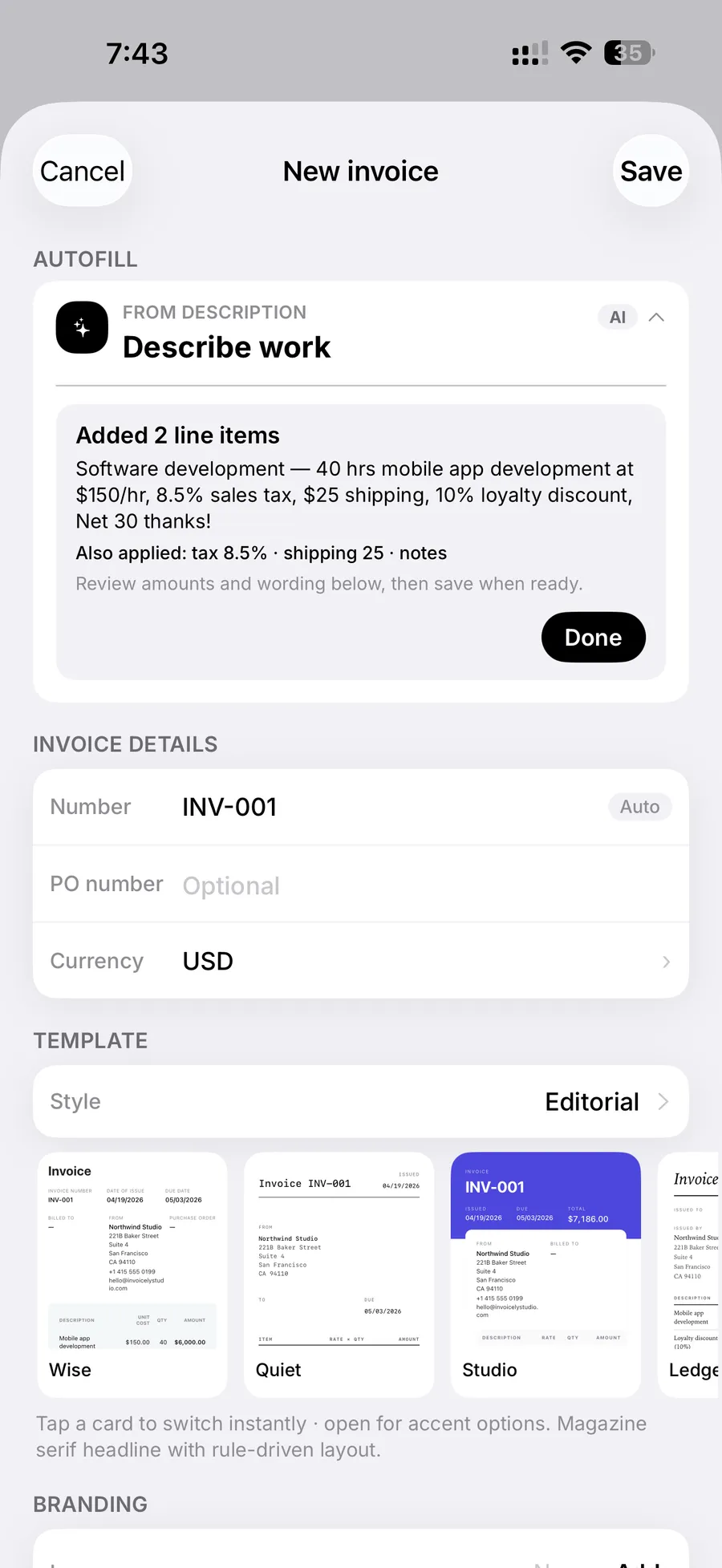
 InvoicelyDescribe the work in a sentence. Invoicely writes the line items, tax, shipping and notes, then asks you to review.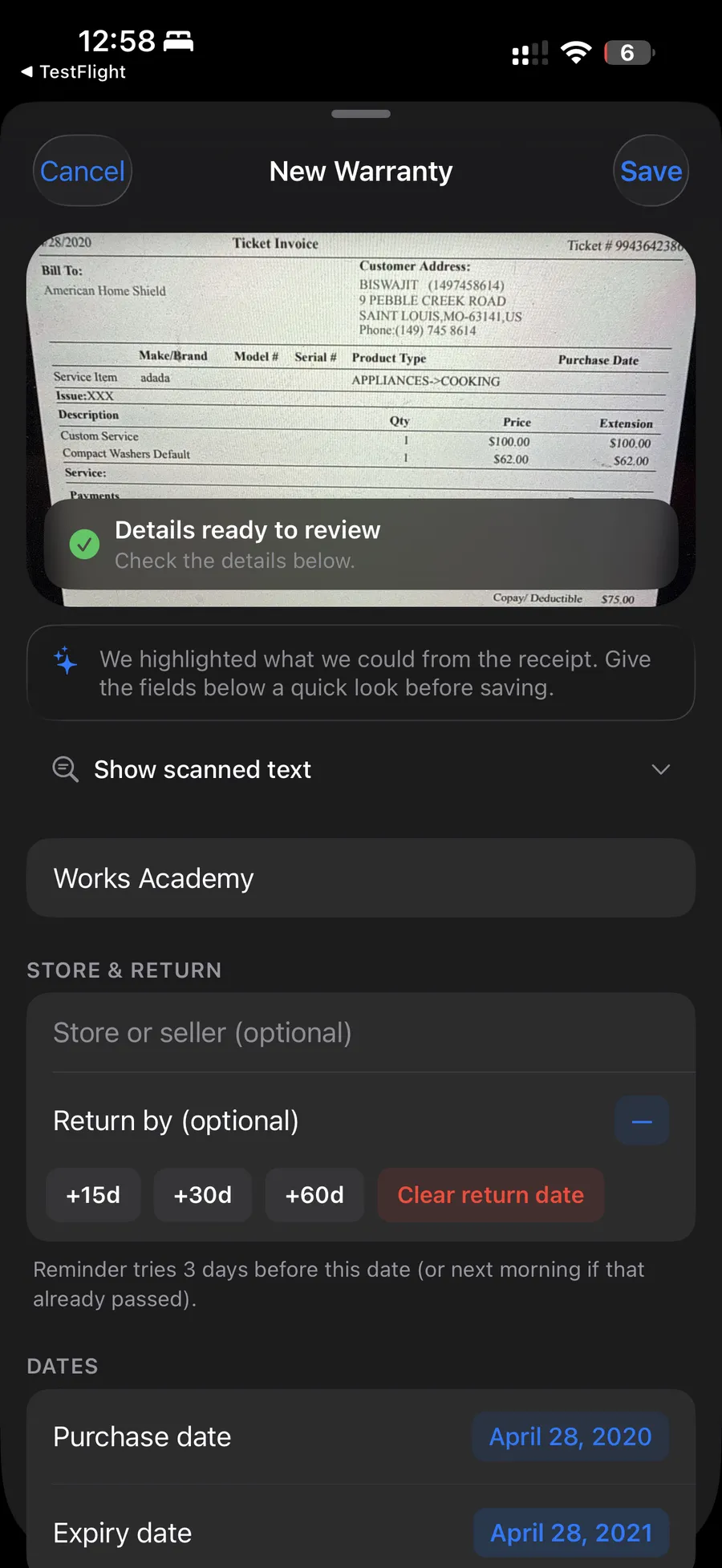
 Receipt SnapThe receipt is read on the phone. What it found is highlighted for a quick look, so nobody types a date.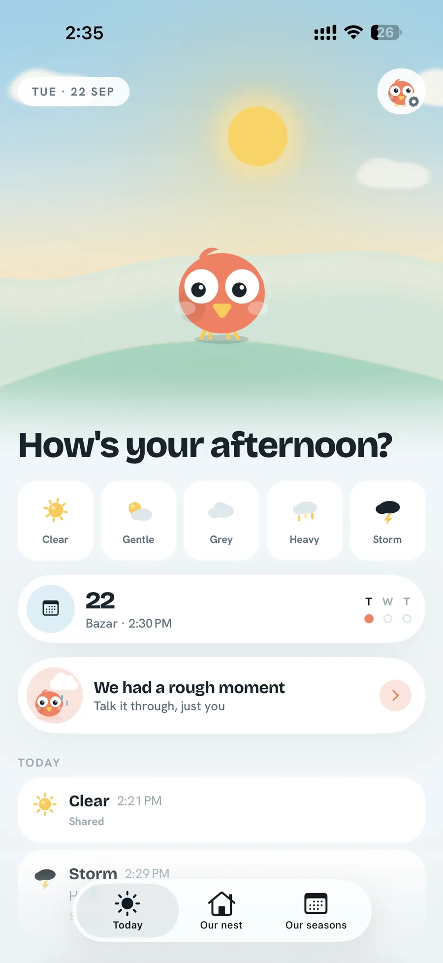
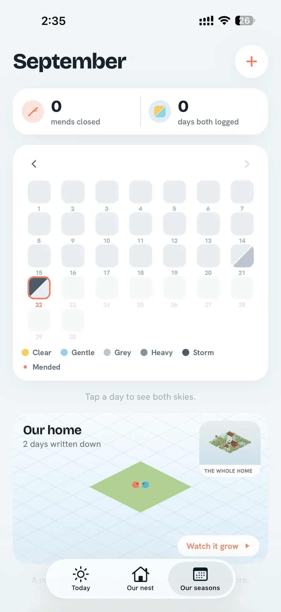
 MendA daily check-in is one tap on five weathers, from clear to storm. No wheel of fifty emotions.
2. A quiet room
Consistency you can't see
Wyatt calls it consistency so complete it becomes invisible: the same icons, colours, spacing, type and interactions everywhere. Most people can't name what's wrong when one icon is filled and the rest are outlines, or one corner is two pixels rounder. They just feel that the app is a bit cheap.
One loud thing
Psychologists call the other half of this the von Restorff effect (1933): in a row of similar things, people remember the one that's different. Put the two together and you get the rule I care about most. Consistency is what buys you a standout. If every card shouts, nothing stands out.
Weekly
€2.99
Monthly
€7.99
Yearly
€39.99
Weekly
€2.99
Monthly
€7.99
Yearly
€39.99
In my own apps that turns into a few hard rules: one press behaviour, two springs, one accent, and the person's own content as the only colour on screen. I wrote them up in one press, one spring.
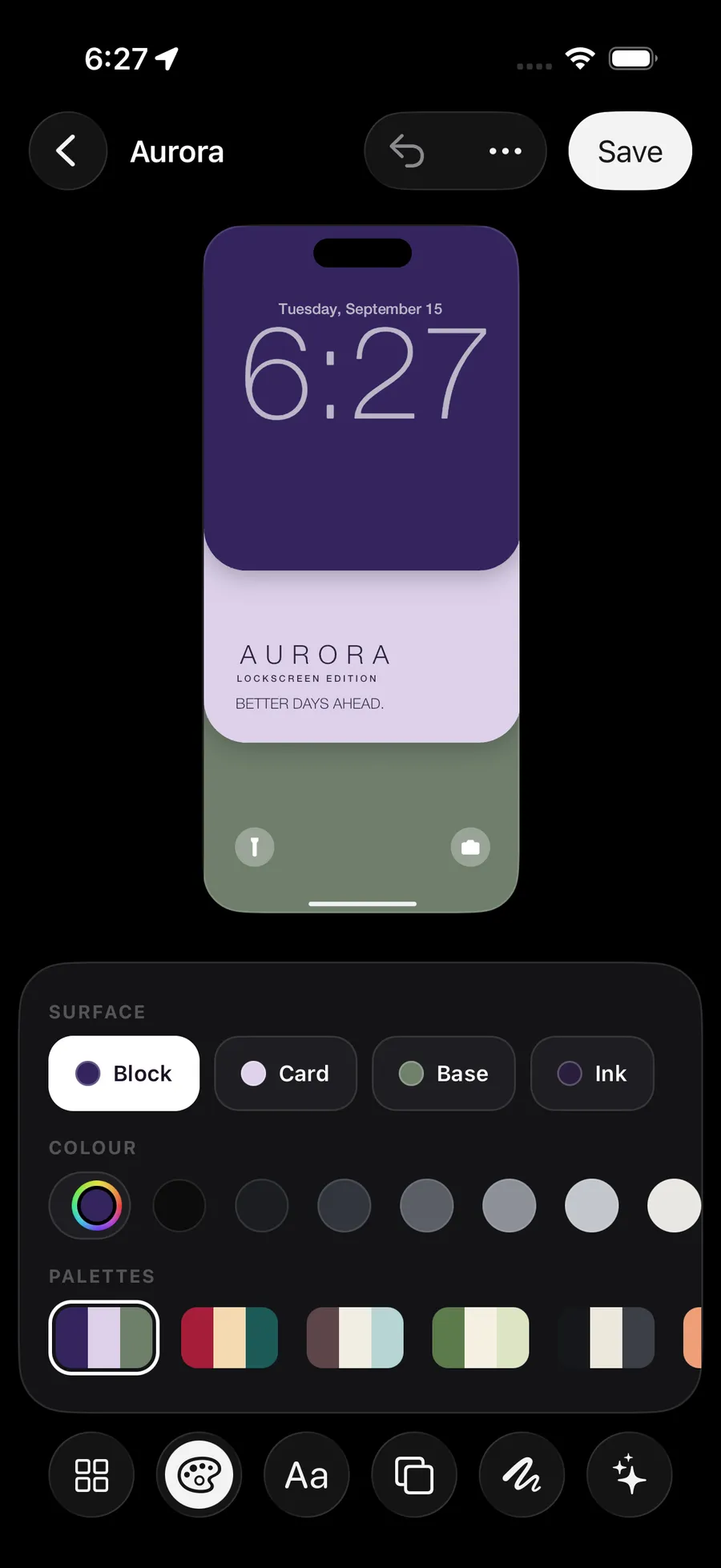
 Lock CardThe editor is greys. The wallpaper you're making is the only colour on screen.
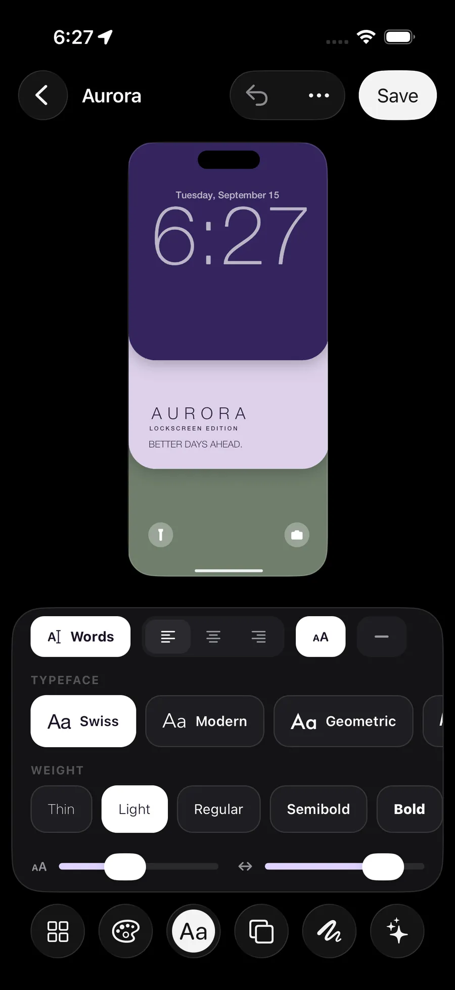 Lock CardSelection is inversion, not colour: the chosen chip turns white. Every tool's tray is the same height, so the stage never moves.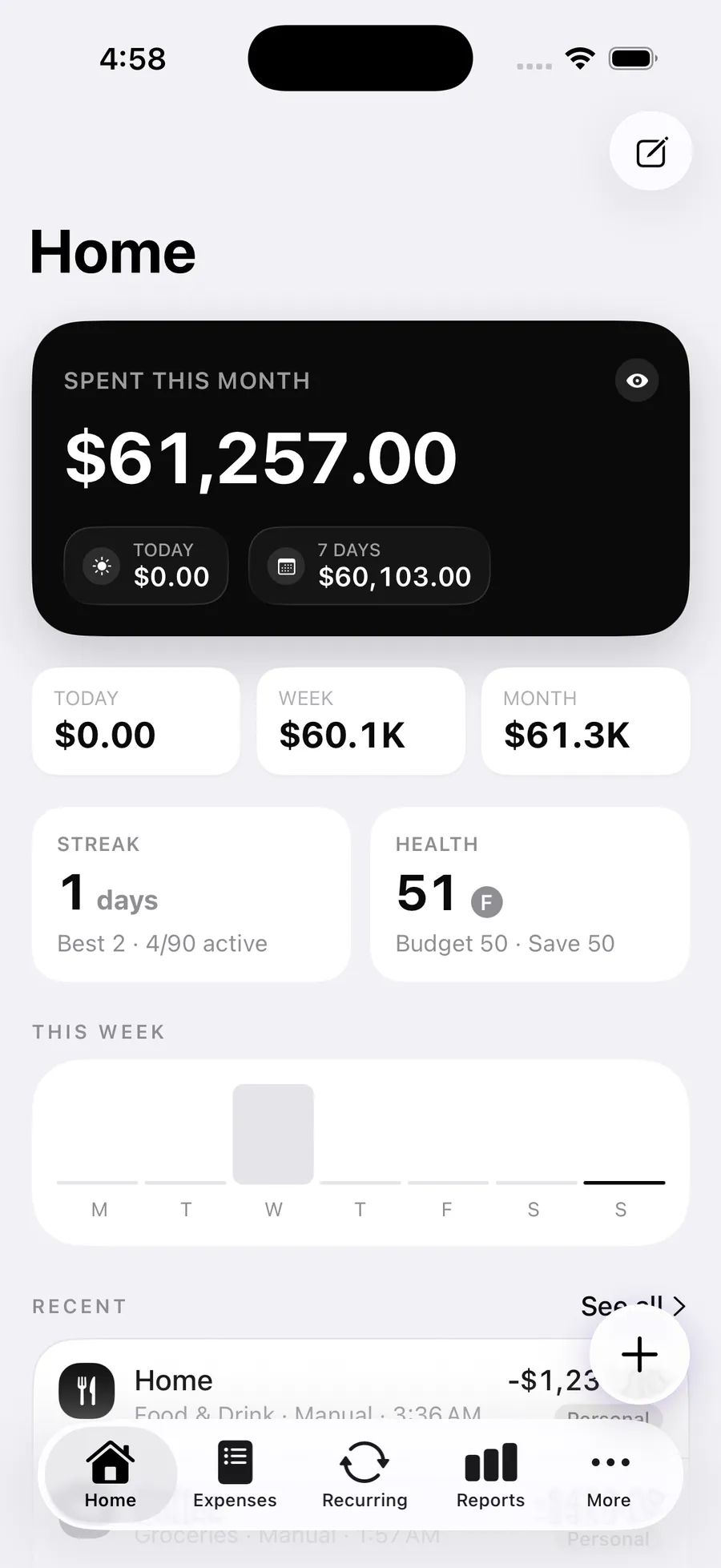
 SpendlyEverything is white cards, except one black card: what you spent this month.
Know when not to animate
An app that animates everything gets slower exactly where people need it to be fast. Picture a flourish on every digit of a card number. Apple's motion guidelines say the same thing in their own words: motion should give feedback and keep people oriented, not decorate. The rule I use: the more often something happens, the less it moves.
ms of motion
Typing
every key
Toggle
dozens a day
Tabs
dozens a day
Sheet
a few a day
Task done
daily
Booked
now and then
Milestone
once
← happens more oftenhappens less often →
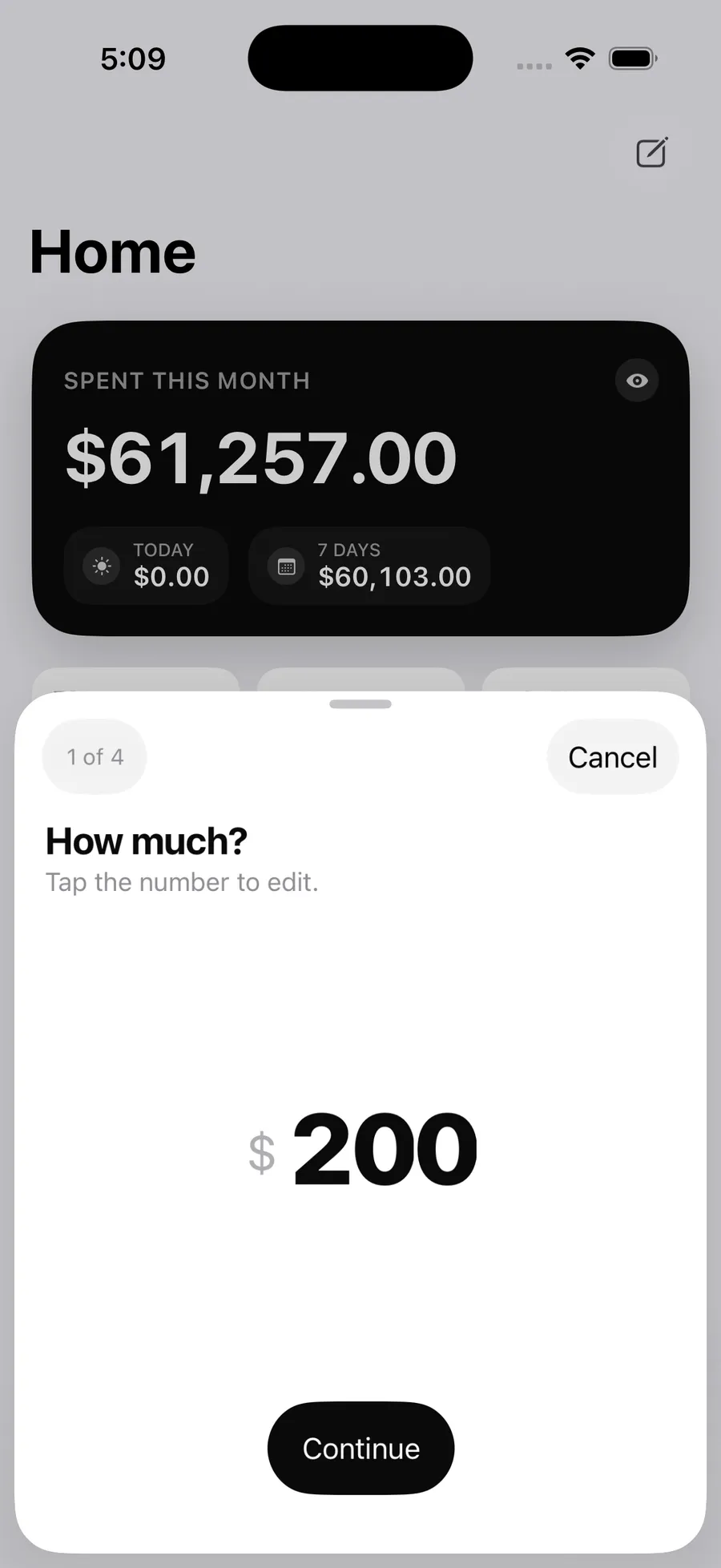
Adding a spend in Spendly opens straight onto the amount, with the keyboard already up, because people do it several times a day. Sending a kiss in Mend gets a whole scene of two birds, because it's rare and it means something.
3. The moments people remember
The peak and the end
Daniel Kahneman's peak-end rule: we judge an experience mostly by its most intense moment and by how it ended, not by the average. In a 1993 study, people held a hand in painfully cold water for 60 seconds, and in another trial for 90 seconds where the last 30 were slightly less cold. Most chose to repeat the longer one. More pain, better ending.
So the middle of a flow can be plain and quiet. Spend the effort on the peak, the moment the thing they came for actually happens, and on the end. And watch the low points, because one bad moment in the middle can become the whole memory.
Delight, earned
Wyatt points at delight in big moments and small ones: Instagram stories turning like the sides of a cube, a little animation when you finish something. I'd add one condition. Delight should answer something the person did, and it shouldn't repeat. Lock Card has a beam of light that runs once around a card when you deliberately choose a colour. It never loops. A reward that repeats becomes noise by the third time.
Rewards you find
The best ones aren't announced. Wyatt's example is Airbnb sending a little postcard of where you're going once a booking is confirmed. Nobody asks for it, which is why people remember it. Spotify made the same idea famous with Wrapped: your own year, handed back to you as something worth sharing.
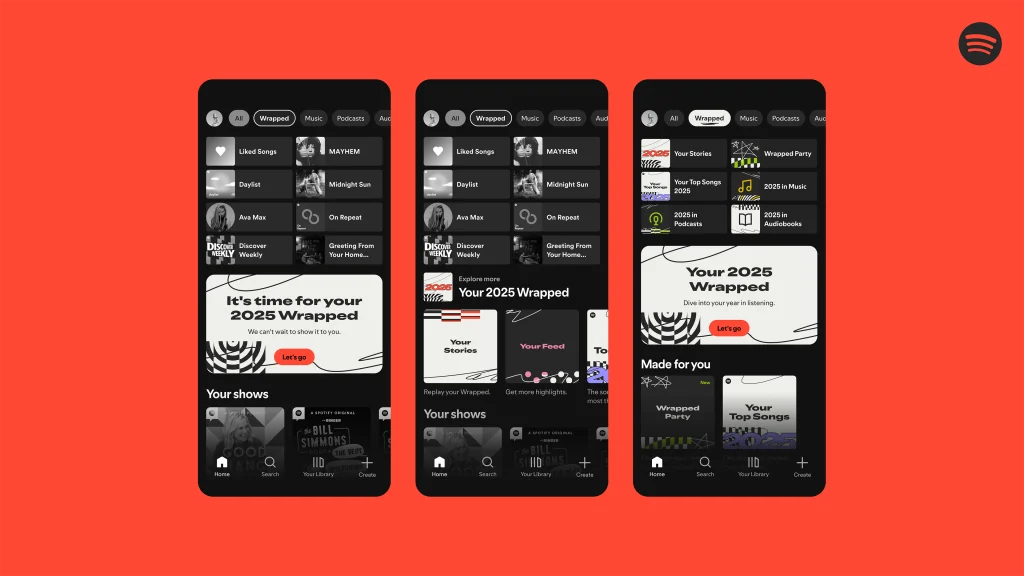
Spotify Wrapped
Your own year, handed back once a year as a story made to share. It lands at the end of the year, which is exactly where memory looks.
Image: Spotify newsroomThe same idea in my apps
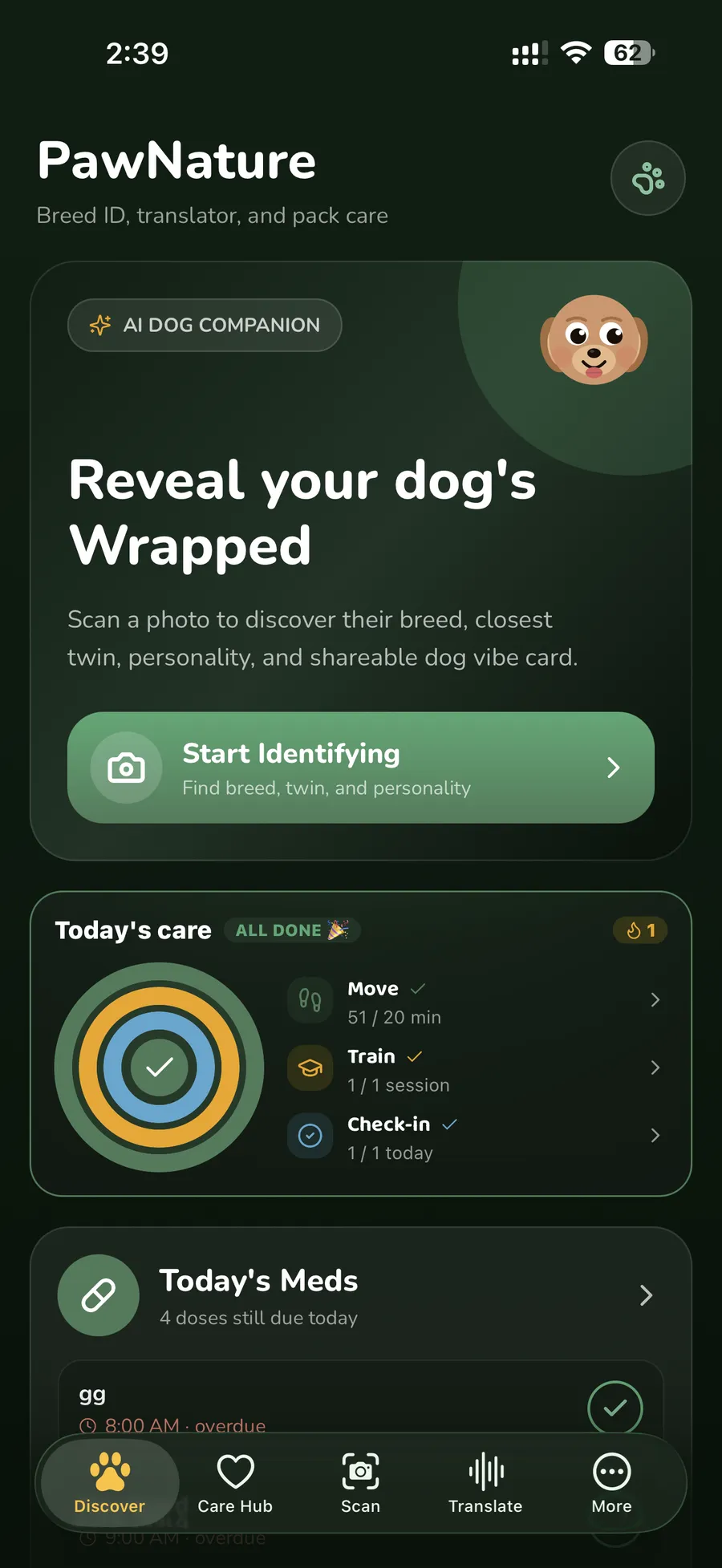
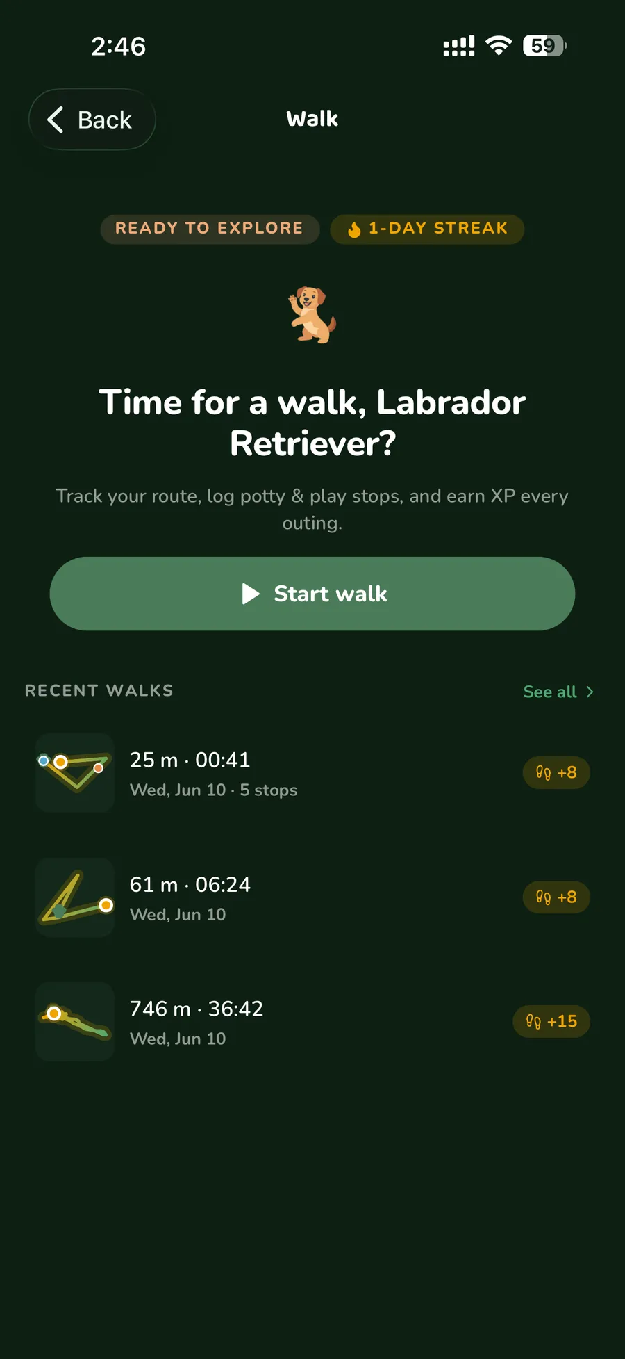
 PawNatureThe first scan ends in a Dog Wrapped: breed, closest twin and personality, as a card made to share.
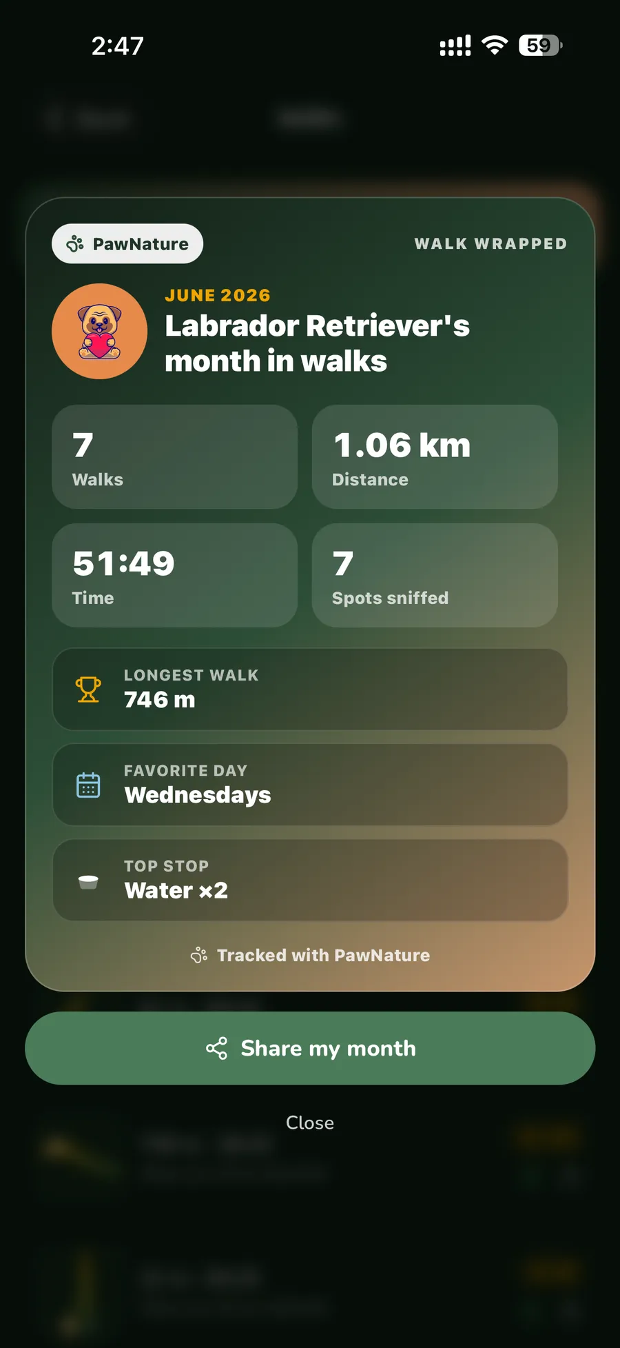 PawNatureThe end of every month gets a Walk Wrapped: walks, distance, longest walk, favourite day.
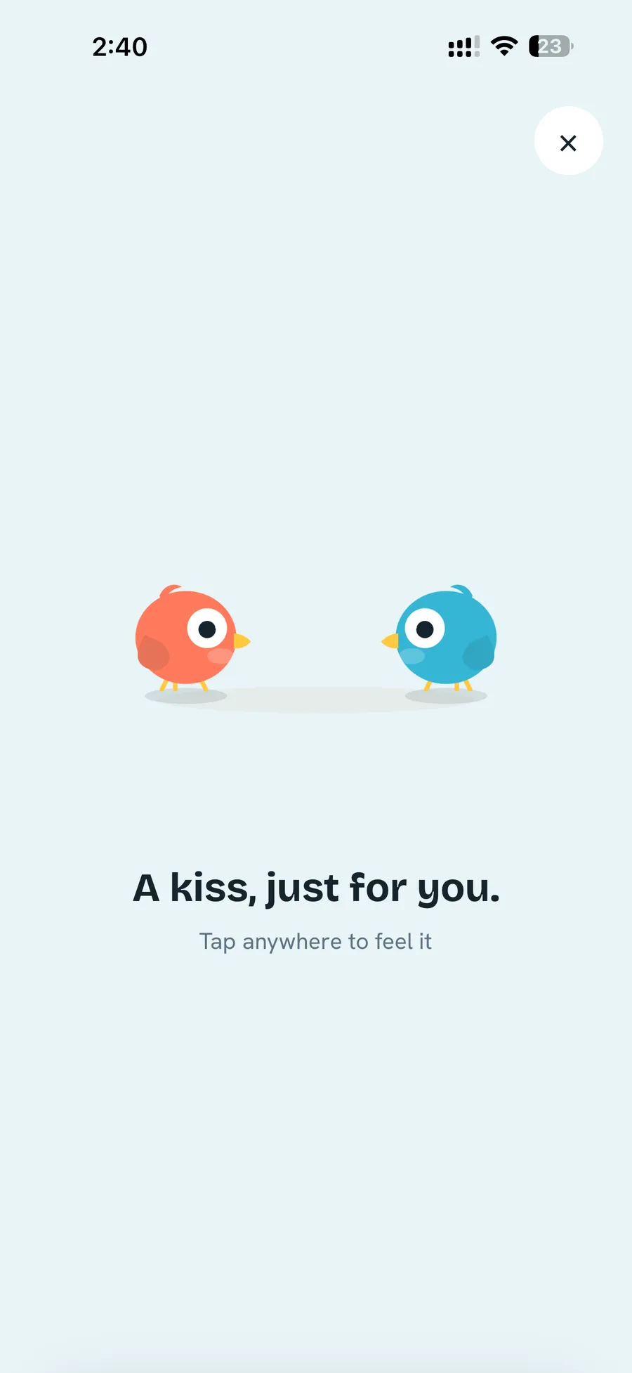 MendA kiss sent from your partner arrives as a small scene of your two birds. It answers something a person did.
The in-between, paced
A good hotel even thinks about the elevator: quiet music, a nice smell, so the twenty seconds between floors feel intended. Apps have elevators too: the time between tapping Pay and seeing Booked, between Upload and Done.
The labour illusion says what to put there. Buell and Norton (2011) found people valued a travel search more when they could watch it work, and some preferred a slower result that showed its progress to an instant one. Effort we can see feels like value.
Instant 0.15 s
Verified
Shows its work 2.4 s
- Reading the photo
- Matching your name and birthday
- Checking the expiry date
Verified
Domino's Pizza Tracker is the classic example: the pizza takes as long as it takes, but watching it move through the stages makes the wait feel shorter. Wyatt also mentions apps that add time to checks that are actually instant. I'd draw the line there: show the work that's really happening, at a pace people can read, and never pad a wait that isn't real.
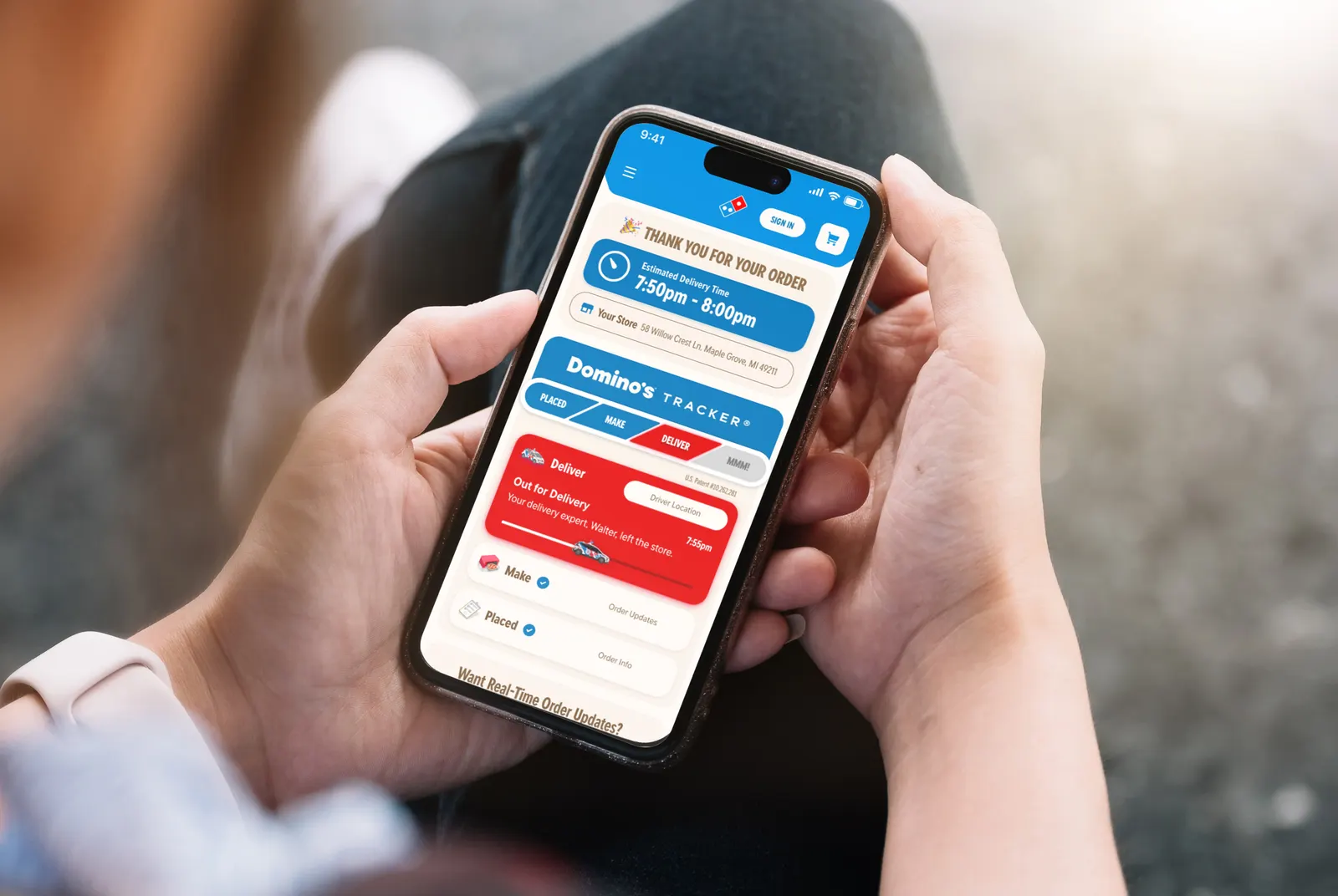
Domino's Tracker
The pizza is no faster. But the wait is split into stages you can watch, from the kitchen to your door, so it feels shorter and more trustworthy.
Image: Domino's mediaThe same idea in my apps
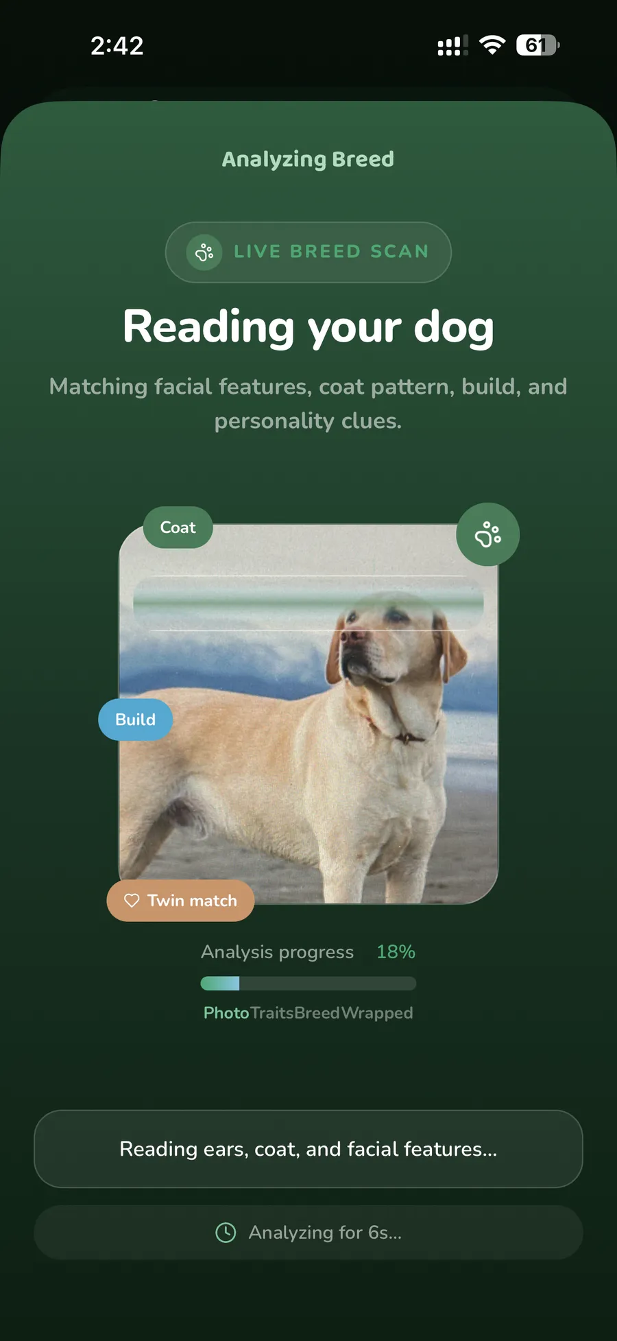 PawNatureWhile the vision model reads the photo: ears, coat, build. The bar is never allowed to reach 100% before the real result is back.
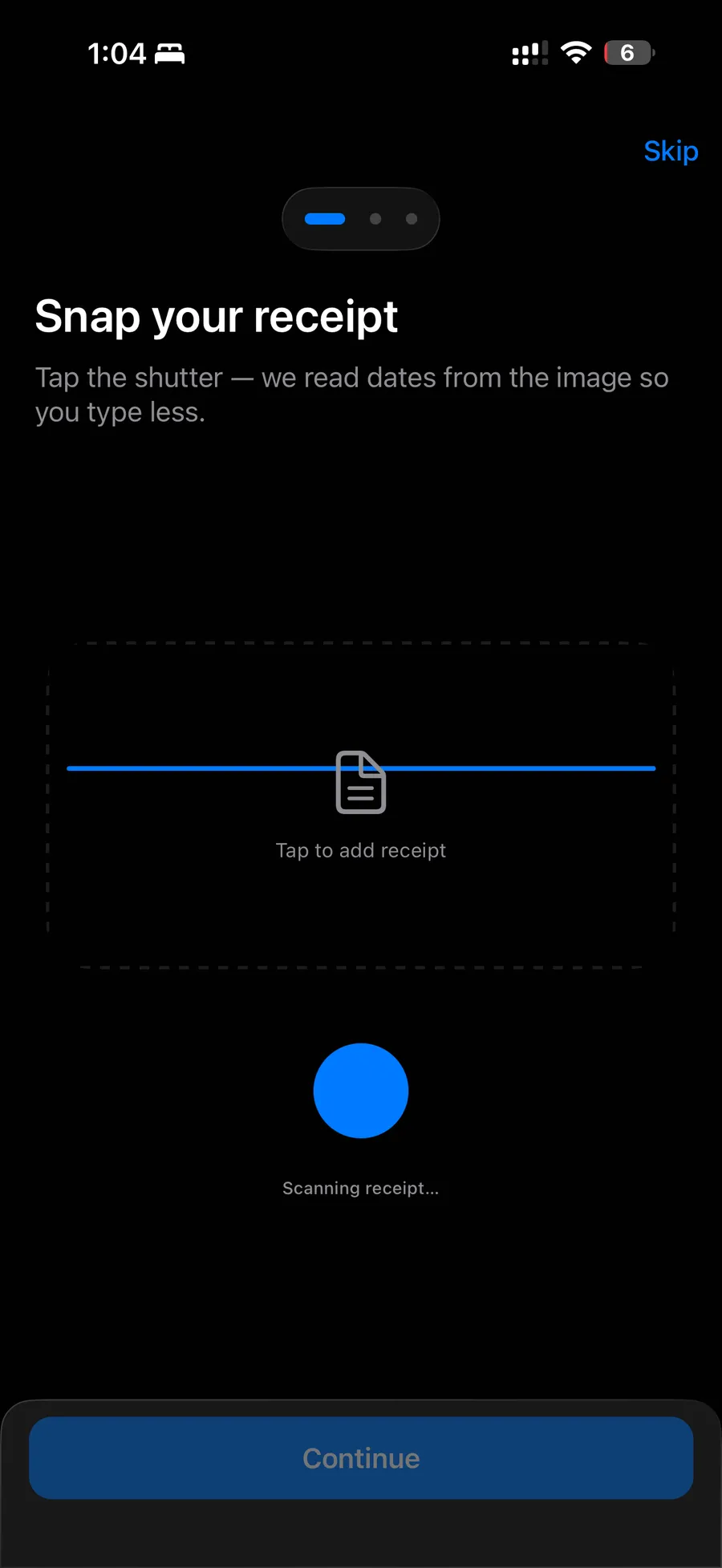 Receipt SnapScanning says what it's doing, then hands over: "We filled details from your receipt when we could. Review them before saving."
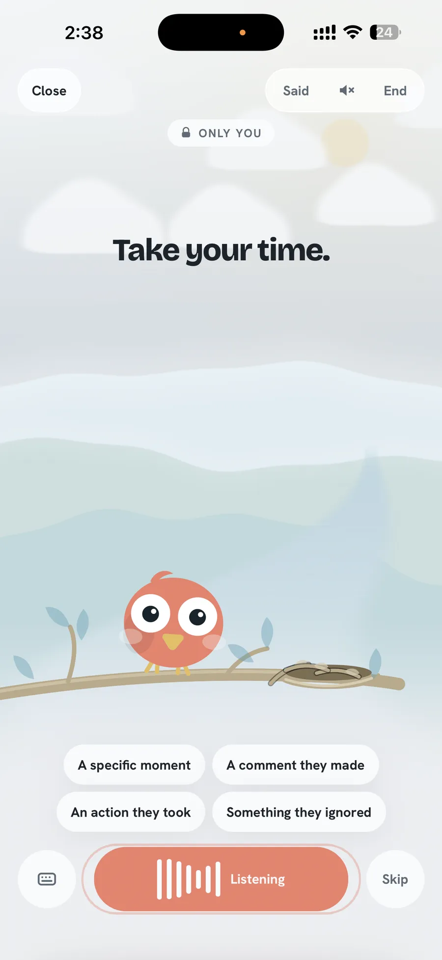 MendIn a hard conversation, the pause is designed too. "Take your time." is a screen, not a spinner.
One honest note on PawNature: its stage labels advance on a timer rather than on each step of the model's work. I'm fine with that compromise because the wait itself is real, and the bar only finishes when the answer does.
4. Momentum
Show the distance
The goal gradient effect was first seen in rats, which ran faster the closer they got to food (Hull, 1932). People are the same: coffee shop customers on a loyalty card buy more often as they near the free drink. In a car wash study, one group got a card needing 8 stamps; another got a card needing 10 with 2 already stamped. Both needed 8 washes. The head start group finished almost twice as often.
8-stamp card
8 washes to go
10-stamp card, 2 free
8 washes to go
Complete your setup
Finish setting up to get the most out of the app.
ContinueSet up 2 of 5
- Create your account
- Pick a currency
- Add your first expense
- Set a budget
- Turn on reminders
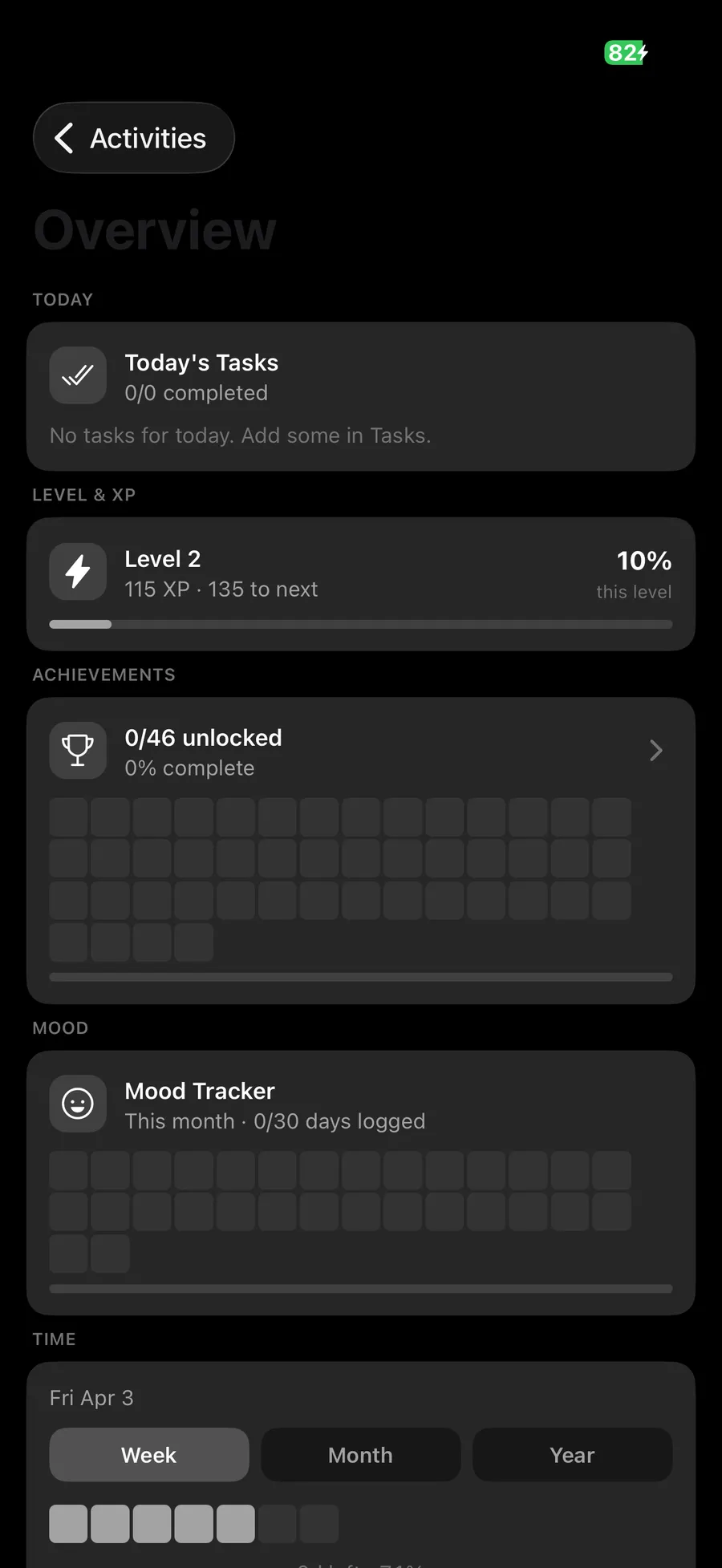
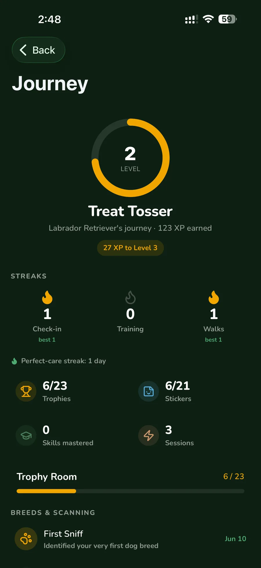
So say how far, not just what. "2 of 5 done" pulls; "Complete your setup" nags. Apple's Activity Rings are the best-known version: a ring that's nearly closed is hard to leave alone. And count what the person already did, like creating the account, as real progress, because it is.
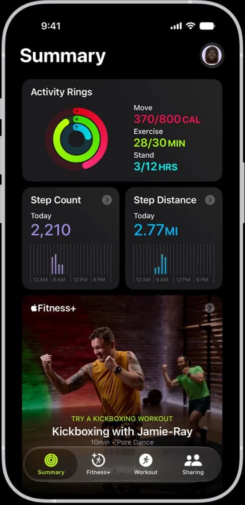
Apple Fitness
Activity Rings show how close you are, not just what you did. Every ring is a distance you can watch shrink, and the last bit is the easiest to push for.
Image: Apple SupportThe same idea in my apps

Open loops
The Zeigarnik effect: unfinished things stay on our minds. Waiters remember unpaid orders in detail, then forget them once the bill is settled. That's why an unread badge or a half finished lesson tugs at you.
Used well, it holds a place for the person's own goal: a draft they started, a lesson they chose. Used badly, the app invents loops for itself: twelve notifications about nothing.
5. When there's nothing, or something broke
Two of Wyatt's points belong together, because they fail the same way: the dead end.
An empty screen that says "Nothing here" leaves people stuck. A good one says what will live here and offers one first step: create your first post, your first invoice. If they've finished everything, it points somewhere else worth going.
An error that says "Something went wrong" is the stranger who, asked for directions, says only "wrong way". A good error tells people what happened, whether their stuff is safe, and what to do next, in plain words.
No data
No invoices yet
Describe a job in a sentence and the first one is drafted for you.
Create your first invoiceImport from a spreadsheetError 402
Something went wrong.
OKYour card was declined
Nothing was charged. Your bank can tell you why, or you can pay another way.
Use another cardTry this card again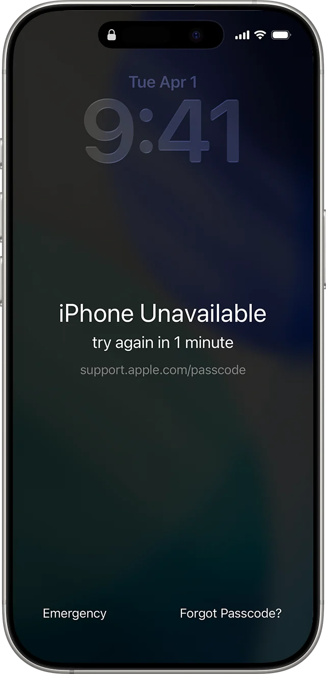
iPhone
Even Apple's hardest error points somewhere: it says when you can try again, and puts "Forgot Passcode?" right on the screen.
Image: Apple SupportThe same idea in my apps
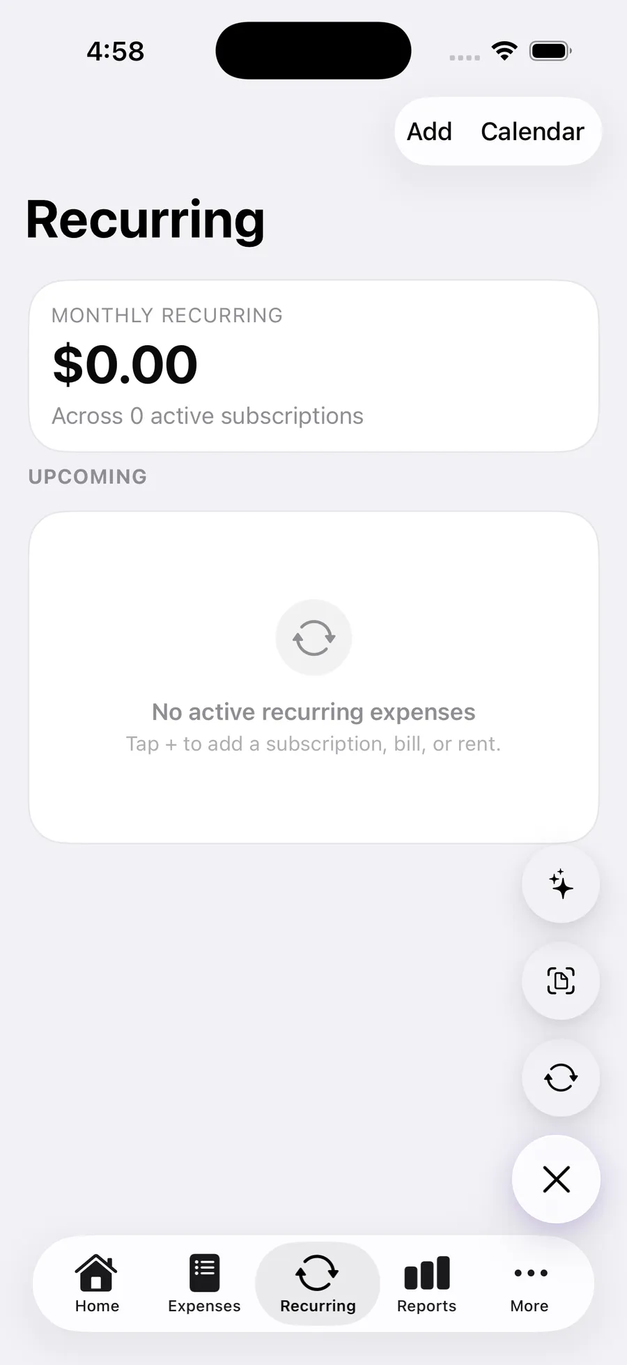
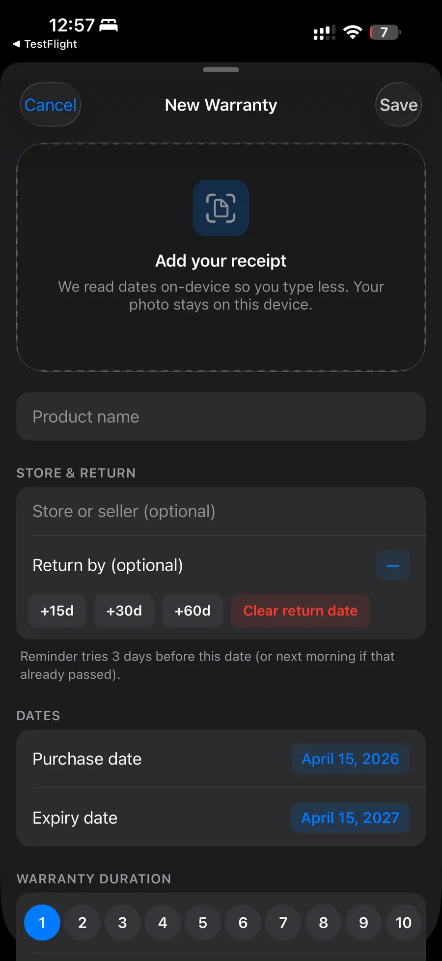
There's more on both in every screen has five states.
6. Hooks, and where the line is
Wyatt's third video is about why some apps are so hard to put down. Five ideas do most of the work, and the most addictive apps stack them.
- Variable reward. You never know what the next swipe brings. B.F. Skinner found rewards on an unpredictable schedule keep behaviour going longest. If every video were great, you'd get bored.
- No stopping cues. A waiter asking "anything else?" is a natural place to stop. A buffet doesn't have one, and neither does an endless feed.
- Open loops. Unread messages and mentions, the Zeigarnik effect from above.
- Social reinforcement. Likes, comments, followers, matches. Being seen feels good, every time.
- Loss aversion. Losing something hurts about twice as much as gaining it feels good (Kahneman and Tversky). A 300 day streak is no longer about the habit; it's about not losing the streak.
Stacked together, they make a loop. Nir Eyal called it the Hook model: a trigger, an action, a reward you can't predict, and an investment that makes the next round more likely. Wyatt drew it for four apps; here they are, plus a kinder version.
1 · Trigger
Boredom. No notification needed.
2 · Action
Open the app and swipe.
3 · Reward
Every few swipes, a great video. You never know which swipe.
4 · Investment
Every swipe teaches the feed, so tomorrow it fits you better.
Leans on: variable reward, no stopping cue
Wyatt ends by saying these principles aren't harmful on their own; used well they help with retention and better recommendations. I agree, and the test I use is simple: would they thank you for it tomorrow? A reminder to practise the language they chose to learn, yes. A warning that a streak with a friend dies tonight unless they open the app, probably not.
Some ways to keep the loop on the person's side:
- Put stopping cues back. Instagram added "You're all caught up" to the feed in 2018, and later Take a Break. A finished list is a reward, not a failure.
- Make streaks forgiving. Duolingo's streak freeze lets you miss a day without losing the run. A weekly goal instead of a daily one does the same.
- Use surprise for discovery. A variable reward that shows people something new in your app is a gift. One that keeps them pulling a lever is a slot machine.
- Notify about their loops, not yours. A reply from a person they care about, yes. "You haven't opened the app in a while", no.
Mend is where I took this furthest, because it's an app for couples, and pressure is the last thing a relationship needs from a phone. The calendar is "a record, not a rating": no streaks, no averages, no score, and a run of hard days isn't a failure. Gestures like "Thinking of you" say nothing to answer. There's even a test in the codebase that fails if any caption for the growing home says streak, missed, lost, score, level or reward.
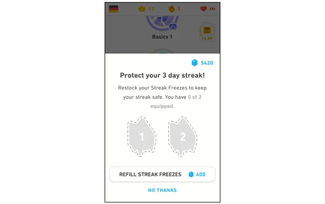
Duolingo
A streak freeze makes the streak forgiving. Look closer and it is also a sale: a refill costs 400 gems. Both sides of the line, on one screen.
Image: Duolingo blog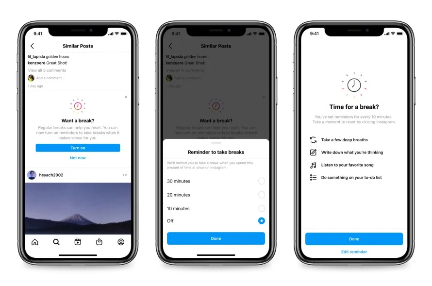
Take a Break reminds people to stop after a time they choose: a stopping cue put back into an endless feed.
Image: Meta newsroomWhere I draw it in my apps
The checklist
| Idea | Do this tomorrow |
|---|---|
| Anticipation | Prefill what you already know. Preselect the usual choice. |
| Choice overload | Recommend one; keep the rest a tap away. |
| Consistency | One icon style, one radius scale, one press behaviour. |
| Von Restorff | Let exactly one thing per screen be different. |
| Motion | The more often it happens, the less it moves. |
| Peak-end | Design the success screen and the ending first. |
| Delight | Answer a choice, once. Never loop it. |
| Discovery | Hide one good surprise for people who keep going. |
| Labour illusion | Show real work while real work happens. Never pad it. |
| Goal gradient | Show the distance. Count what's already done. |
| Open loops | Hold a place for their unfinished things, not yours. |
| Empty states | One first step, never "nothing here". |
| Errors | What happened, is my stuff safe, what do I do now. |
| Hooks | Would they thank you for it tomorrow? |
Give it to your agent
A coding agent will build any screen you ask for, but it won't think about any of this unless you tell it to. So I turned this article into a skill: the rules, the motion budget, the line on hooks and the checklist, written for an agent to follow when it designs or reviews a screen.
premium-app-feel / SKILL.md
Eight sections of rules, a motion budget and a review checklist, written for an agent.
curl -fsSL --create-dirs -o ~/.claude/skills/premium-app-feel/SKILL.md https://mbuilds.studio/skills/premium-app-feel/SKILL.mdInstalls it for Claude Code. For Cursor or Codex, paste it into your project rules or AGENTS.md.
Credit for the ideas, and for the examples I've attributed to him, goes to Wyatt. The grouping, the figures, the screens and any mistakes are mine. If you build apps, his channel is a good one to follow.
Previous: one press, one spring. Back to the start of the series: mobile UI standards, measured.
Building something like this?
Booking new projects for Q4. Replies within 24h.